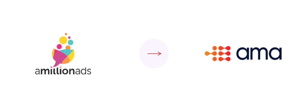
When we launched the current A Million Ads brand back in 2016, it reflected the young, ambitious start-up we were at that time – bold, bright, and in stark contrast to the grown-up brands of the media world.
6 years and over 10 billion impressions later, we’re no longer the new kid on the ad-tech block and the time has come for us to recognise everything that’s changed since with a new identity. Our new brand is slick and clean. It’s clear about exactly who we are and what we do.
And whilst we’ll always be A Million Ads (including across our website and email), we’ve decided to lean into the acronym that has been given to us by our clients over the years – AMA. As part of this, we’ve redesigned our logo. Our new iconography holds a dual-meaning, representing both the shape of audio wave forms and a dot-dash pattern that spells AMA in Morse Code.
Of course, our new branding is represented across all our public-facing platforms, including our Studio tool, which has been given a new lick of paint whilst retaining the same form that our clients already know.
Audio Has Never Looked So Good.